Nowadays, we do almost everything online – including shopping. According to the latest estimates, global e-commerce sales jumped to $3,748.5 billion in 2020, up 4% from 2018. And from 2021 to 2025, the average growth rate of global e-commerce is expected to reach 47%. That’s why now is the perfect time to be in e-commerce.
If you’re selling anything—no matter kitchen tools, clothes, or food, you need to get on board the e-commerce site train. An e-commerce website allows you to build your brand, connect with more customers, and sell more products. Since more and more people shop online, it’s necessary to have a website designed for consumers if you have your own business. So how to design a successful e-commerce website?
1. Focus on a brand palette.
Regardless of your product category, your website must be consistent colors and fonts. Each color triggers specific feelings, emotions, and behaviors in people. So if you want your eCommerce site to convert, you need to use these color inspirations to your advantage.
For example, if you want people to make a purchase, use a bright color like red to highlight the buy button. According to a researcher, the red color can inspire feelings of excitement and passion, which is what drives consumption. Studies show that making buttons red can increase conversion rates by up to 34%. The point is, color is one of the most powerful tools in your design toolbox. It can have a huge impact on your eCommerce design if you know how to use it.
2. Keep the design clean.
One of the top rules you should keep in mind during your eCommerce design process is “simplicity.” Simple is always better when it comes to designing an e-commerce website. The more elements on the page (colors! banner ads! all popups!), the more it takes away from the whole point of the site – closing the sale.
You don’t need a ton of bells and whistles on your eCommerce site. All they do is a distraction. Keep your designs clear, clean, simple, and focus on selling.
A clean website with a clear path to purchase is essential for your eCommerce store to generate revenue. If the buyers have to look for more information, they will lose their patience easily with your website. When you add design elements to your website, make sure you always have a specific answer to “how will this drive my buyer’s conversion journey.”
3. Use high-quality images.
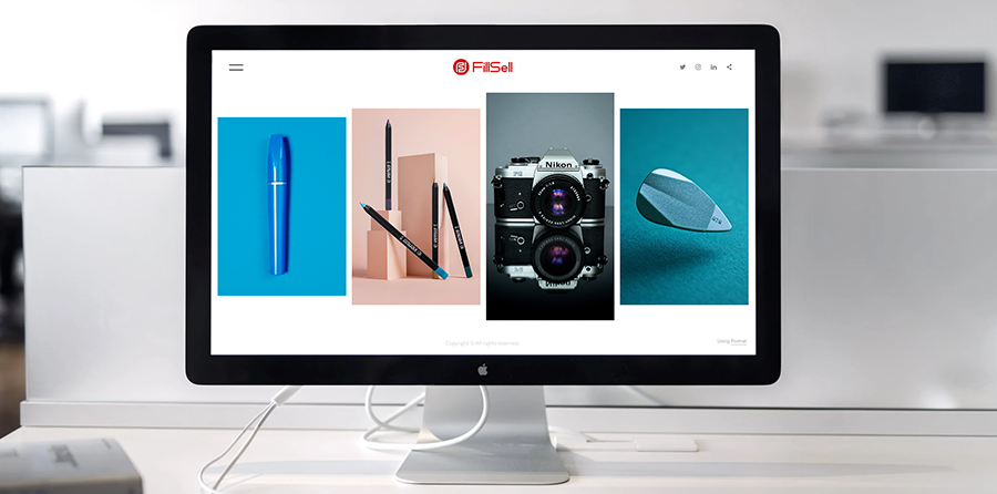
In the web design world, it’s elementary knowledge that images can increase conversions (for example, a recent case study showed that incorporating more relevant pictures into a website design increased conversions by over 40%). In offline stores, people can see products in person and then purchase. While it is not possible to hold a product online, the shopping experience can be enhanced with high-quality product images.
Getting professional pictures of all your products (getting them from many different angles) goes a long way in building confidence and trust from your customers. Having quality product images on your website can solve the pain point of users not being able to see the product before buying it.
So when you design your website, keep it central to highlight your products with high-quality images to create an impressive gallery. Give your buyers the option to view images with zoom options so they can take a closer look at the finer details. If possible, add product videos.

4. Make transactions easy and transparent.
One of the most significant parts of an e-commerce website is transaction activity. A clunky checkout is definitely to kill sales faster. Make your checkout page design clean, simple, and easy to navigate. Choose a website platform that integrates with major payment gateways like PayPal or Stripe. It is better that include multiple payment options, like debit and credit cards, net banking, and UPI payment.
Make everything about the process at a glance: what information is needed to process a purchase (and where they need to enter it), the different shipping options available (and how much they cost), and what to do if something goes wrong with their order, otherwise they will do a return. After the purchase is complete, direct your customer to a confirmation page so they know everything is done.
Running a successful e-commerce website is no easy task. Fortunately, there’s a lot you can do to improve your chances of driving sales and getting your customers to come back. What are you waiting for? Use these tips to give your online store the overhaul it deserves.